Tag Archives: redesign

What Happened to Comic Book Resources?

“Change is good.” That’s a slogan I very vividly remember from a McDonald’s commercial around the turn of the century. A classroom full of kindergartners is shocked to find out that the Golden Arches are now serving white meat chicken nuggets, and are silent as one of their members takes the first tentative bite. Once she speaks those three words they break out into cheers, ecstatic that their beloved nuggets are just as delicious as before. Change is good. Or, more accurately, it can be.

This past Tuesday I was going through my handful of comic book news sites only to find that Comic Book Resources [also known as CBR], the fourth and last on the list, was borderline unrecognizable. Instead of seeing-

oldcbr2014

-like I was used to, I was greeted with-

newcbr2016

While I was taken aback by the seemingly sudden redesign, the truth is that if I’d been more observant I would have seen this coming from a long way off. Continue reading

“Fully Clothed” ≠ “Well-Designed”

From November, when it was announced, until now right around its release the news outlets have been reporting on the new Ms. Marvel, particularly due to its protagonist being a Pakistani Muslim teenage girl [FYI it is also good]. With all this attention it’s inevitable that every facet of the character would be scrutinized, including what she’s wearing.

Over at the Washington Post they published an article titled “MS. MARVEL: Marvel Comics’ new focus on women ‘characters and creators’ aims to defy the ‘scantily clad’ cliche”. While it strangely refrains from addressing what Kamala Khan’s actual costume looks like, the sentiment is clear: comic books used to be a boys’ club and they’re seeking to change that. Marvel EIC Axel Alonso states that the female heroes headlining their new books-

“are not the big-breasted, scantily clad women that perhaps have become the comic-book cliché. They are women with rich interior lives, interesting careers and complicated families who are defined by many things—least of all their looks.”

It’s difficult to run from your past, any lion cub exiled from Pride Rock will tell you that. The main issue is that while Alonso [and I really do like the guy] uses the word “perhaps” the fact is that there are still costumes out there that would bar their wearers from entering the Vatican. Never fear, though, because this is the internet and on the internet someone always has a solution. Continue reading

Why Superman’s Briefs Matter

The Hobbit is due to touch down in theatres next month [yes, I watched the Grey Cup last night], and with it will come a new, full trailer for Zack Snyder’s Man of Steel With all of that happening, I’m going to touch on . . . hm, maybe not the best choice of words. . . I’m going to write a little about the new suit we’ll be seeing in the 2013 summer flick.

On the right is what Henry Cavill is expected to look like as the Last Son of Krypton. Many fans have [as usual] expressed great displeasure in the loss of Supes’ signature undies, as can be read in the aptly titled “‘Man of Steel’: Is Superman’s new suit made of fanboy Kryptonite?

What’s probably unknown to most of them, however, is that director Zack Snyder fought to keep the supehero’s look traditional. In an interview with the New York Post he said:

“The costume was a big deal for me, and we played around for a long time. I tried like crazy to keep the red briefs on him. Everyone else said, ‘You can’t have the briefs on him.’ I looked at probably 1,500 versions of the costumes with the briefs on.”

Ultimately the studio [as usual] had their way, and the iconic red briefs were done away with. There are a few reasons why I think they should’ve stayed, though, and they have nothing to do with the iconic depictions of the character.

The first reason, if you look up, is staring you right in the face. It’s- well, it’s distracting to say the least, and was actually a problem when suiting up Brandon Routh for the 2006 Superman Returns. From what I can tell, costume designer Louise Mingenbach had her hands fu- sorry . . . had a lot to deal with when it came to the suit. The film’s IMDB page tells us:

According to an article in the 12 September 2005 issue of Newsweek, the biggest question concerning Superman’s costume involved the size and shape of the bulge in the front of his tights. Costume designer Louise Mingenbach finally decided on a bulge that wasn’t too big. “Ten-year-olds will be seeing this movie,” she explained.

A less reputable source [The Sun], told second-hand via KillerMovies reports that a source had this to say about the film:

“It’s a major issue for the studio. Brandon is extremely well endowed and they don’t want it up on the big screen. We may be forced to erase his package with digital effects.”

The current costume design is definitely not doing them any favours in that department, and if anything calls even more attention to Superman’s unmentionables.

My second point has to do directly with design. As archaic and old-fashioned as the red shorts over tights are, they were great in breaking up the blue of the rest of the costume. Although the golden belt buckle attempts to do that in Cavill’s costume, it ultimately fails, and in fact draws added attention to my first point.

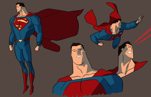
To bring up something I mentioned in passing in my post about the immensely talented Kris Anka, there are ways of omitting the briefs while still maintaining a good balance:


In the above design Superman’s midsection is broken up by  the two red lines and the golden buckle, which form an incomplete belt. This, along with the darker blue of the costume’s sides does wonders in not making it feel like the character is simply wearing a full set of blue tights and a cape.

I suppose we’ll have to wait until next summer to really determine whether or not the new suit works. Until then, these are my thoughts

If you want to keep reading about this particular topic, io9 wrote a great article called “The War on Superman’s Underpants.”

Storm and “Black Hair”

This is somewhat of a continuation off of yesterday’s Fame Day post, concentrating particularly on the Marvel character Storm. Kris Anka’s design for the weather-wielding Ororo Munroe harkens back to her appearance in the 80s [seen on the right].

Keeping consistent with most changes to beloved comic book characters, the mohawk was met with both praise and scorn.

Trawling the comments section of the ComicsAlliance article on the topic, I came across two guys who were very interested in not just the style of her hair, but the state or quality of it as well.


Earlier on Scafin commented about wanting to see Storm’s hair in its natural state. In following up with my reply to his thoughts  [and with a slight miscommunication as to what I meant by “black hair”] he said:

I don’t mean color, though. I really want to see her with white, afro-textured hair. I understand why she was given relaxed hair when she was introduced, as that was the norm back then, but the ubiquity of relaxed hair has declined since then.

The thing is, Storm as a character has always had straight, white hair. The fan-run Marvel Database tells me that she’s descended from “an ancient line of African priestesses, all of whom have white hair, blue eyes, and the potential to wield magic.” That answers Scafin in that the character has never had “black hair.” It’s part of who Storm is now [having been depicted as a young child that way] and to retcon that many years of portrayal would fare poorly with fans.

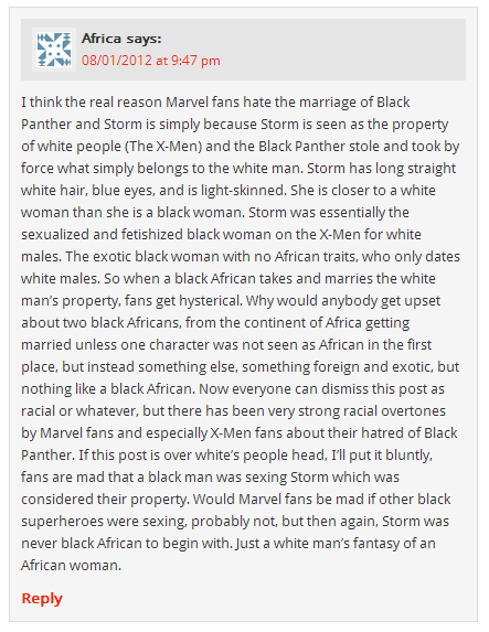
This leads to another question, though, which is why Storm was designed this way at all. This comment on an article about Storm’s marriage to the Black Panther had the following to say about the character’s creation:

I’m going to break this down as quickly and efficiently as possible, so we can concentrate on the more important aspects of the comment.

  • People are upset about the marriage because Marvel didn’t lead up to it well enough. In other words, they weren’t invested, and that’s adding to the fact that marriages in comic books typically do not work [see Peter and Mary-Jane in “One More Day.”]
  • That this is the sexual domination of White over Black when one of the very first relationships Storm gets into in the comics is with Forge, a member of the Cheyenne people. He was not, and still isn’t, white.

David Brothers, a blogger on staff with ComicsAlliance, agreed with part of what Africa had to say, commenting on the same article:

I liked Hudlin’s run on Panther. It was one of the precious few times that Storm actually felt like a black character, instead of a fetish object with blue eyes and perfectly straight hair.

This is in stark contrast to the article he wrote for Marvel a year earlier titled “A Marvel Black History Lesson Pt. 1.” In it he has more than a few good things to say about the heroine, which can be summed with these words:

If Gabe Jones stood for reality, Black Panther for ingenuity, Robbie Robertson for integrity, The Falcon for equality, Luke Cage for self-awareness, and Misty Knight for unadulterated cool, Storm was the combination of all of their traits and more. She was the daughter of a Kenyan princess and a photojournalist from Harlem, and therefore a direct link from African Americans and the continent known as “the Motherland.” She was powerful on a world-class level, refused to allow anyone to be her master, and commanded a massive amount of respect from all who knew her.

Taking into account Brothers’ apparent conflict in viewing the character, I
personally come away from this with the knowledge that Storm is more than just eye candy, she is a strong [in terms of power and character] heroine on par with many of her peers.

While Storm having straight hair may have been a product of the time she was created in, that in no way affects who she is as a character. Marvel has the right to maintain consistency in how she is portrayed, and has other characters who are better examples of having “black hair.” While the event of her marriage had its flaws Storm remains someone who has both strong ties to Africa and one of the most prominent black superheroes of all time. The straightness of her hair should in no way detract from that.

Fame Day: Kris Anka

Today’s Fame Day post is dedicated to the artistic genius of Kris Anka. I’ve been following his work on the superhero redesign blog Project : Rooftop for some time, and was thrilled to see him get the recognition he deserves on ComicsAlliance yesterday.

Apparently Anka had been hired by Marvel to design the costumes for the new Uncanny X-Force series, and he puts his own spin on the new roster of Storm, Psylocke, Spiral, Puck, Lady Fantomex, and their nemesis Bishop.

The biggest changes are in Psylocke losing the unitard for more of a full body suit, and Storm reverting to her 90s look with a fantastic-looking mohawk. Utility was definitely prioritized, and story as well. Working with Uncanny X-Force writer Sam Humphries it was decided that the grey in Spiral’s outfit should be opaque. This fit with the knowledge that Spiral was a character was “a little more confident in her sexuality,” without making the costume’s raciness over-the-top .

Anka’s design philosophy for the team is as follows:

The costume themes were something from the very beginning that I wanted to strive for. I felt that every costume should not only highlight the personality of the character it is wrapped around, but also of the function that the costumes will serve towards. At the end of the day, these costumes have to look like they can get into a tussle, and actually be able to handle it.

This certainly translates over to the many other redesigns that can be found on his various art blogs, and one I want to highlight is his version of the  Avengers.

From left to right: Iron First and Crystal, Ares and Ms. Marvel, Iron Man and Venus, Bucky (Winter Soldier) and Thor.

In another illustration, entitled “avengers – dont f-ck with us,” the entire team is explained in the description, with the idea that he wanted his Avengers to be “a family first off.” Ms. Marvel acts as leader, Venus as a strategic asset, Ares carries Stark-designed weapons that can collapse in on themselves. Every design point has a reason, and it all adds up to clean, recognizable  costumes.

His redesigns for DC’s trinity [Superman, Batman, and Wonder Woman] are images I go back to over and over. His vision of the the Last Son of Krypton shows that you can do away with the red shorts over blue tights, provided you break it up with a little bit of colour [the yellow buckle, the red lines on the side]. I’m looking at you, costume designer for Snyder’s Man of Steel.


All in all, Kris Anka is a name to look out for. In the ComicsAlliance interview Humphries admits that “My only wish is that we could keep going until we redesigned the entire Marvel Universe!” If only that were true.

You can find Kris Anka on various places on the internet:

deviantART: http://anklesnsocks.deviantart.com
Blogger: http://anklesnsocks.blogspot.ca/
tumblr: http://kristaferanka.tumblr.com/
twitter: https://twitter.com/kristaferanka

And don’t forget to search for his stuff on Project : Rooftop!

Aaron Diaz: Has a Lot of Opinions About DC

If you peruse the website ComicsAlliance daily, like I do, then you’ve stumbled upon the increasingly controversial work of webcomic artist Aaron Diaz.

Starting in early October, with his post on tumblr Rebooting the Justice League!, Diaz has gone from being the creator of webcomic Dresden Codak to becoming the supposed saviour of the comic book industry. Featuring his own personal take on DC’s super hero team, he redesigned everything from costumes to origins.

This spawned a few other posts, such as Rebooting DC’s Villains!, in which he recreates the Legion of Doom as the “Secret Society,” and Rebooting Batman!, where the Caped Crusader is recreated to fit his new alternative DC canon [his earlier incarnation of the Dark Knight can be seen here]. Beginning with his take on the Justice League, each post has been featured on Comics Alliance, much to the delight/irritation of its readers.

Diaz states clearly that his reboots were spawned by DC’s own “New 52” [which I discussed, in part, here]. Their new designs for Starfire and Harley Quinn, in particular, were targeted in their elevation of sex appeal over utility. Diaz gets downright aggressive in his post DC Comics Reboots Dresden Codak!, where he imagines what it would be like if the company redesigned his own webcomic.

As you can see above, the female characters are overly curvaceous and barely dressed, while the men are very obviously the same male body type with different costumes and hair colour. While a point is being made satirically, he single-handedly slams the work of an entire publishing company instead of the individual artists or writers responsible for the designs he dislikes.

As one would expect, the comments on his tumblr consist almost entirely of praise for his work. One particular question asks “Can you just, like, take over DC and make this happen for reals? These redesigns actually look like superheroes I WANT to read about.” On his Justice League reboot Stephanie Charette admits that “I have never before commented on anyone’s Tumblr, but I must. This is what the comic’s industry needs to do. THIS. THIS. THIS.”

Leaving his tumblr for more balanced opinions, the comments on his features on ComicsAlliance provide a happy medium between blind adoration and outright disdain. Paying no heed to the ones about the rate he updates his comic [which is neither here nor there], there are comments which were written calmly and logically.

On one of ComicsAlliance’s latest features, Aaron Diaz’s ‘Tales of the Uncomfortable’ Takes a Halloween Look at Harley Quinn, a commenter states that “The message of DC has been beaten like a dead horse (particularly on this site) and I really don’t know what else to say anymore.” Thankfully someone else does, and they bring up a post on the tumblr of webcomic artist Amanda Lafrenais. The commenter even pulls a direct quote:

And I REALLY enjoyed, save for minor nitpicks, Aaron Diaz’s redesigns, criticisms and praise of costumes. However his newest post on the subject about cleavage and crimefighting kind of made me wanna talk about it. A friend pointed out that, yes baring your breasts is very impractical in fighting. But so are capes. And spandex. And having no padding or armor.

In her post Lafrenais goes on to push the idea that costumes aren’t really intended to be realistic [their utility further broken down by Edna Mode]. While she admires what Diaz has done, she implores artists not to “take the fun away,” and that there is a point where “practicality ends and fantasy begins.” Even though her post doesn’t address part of what Diaz is railing against, the overt sexualization of women, she does attempt to soften the extreme logic from which many of his designs were birthed.

On a personal note, I liked many of his redesigns, particularly his take on Batman and Robin. Conversely, I strongly disliked  some of his ideas, primarily taking Gorilla Grodd and making him more “Planet of the Apes” than “Mighty Joe Young.” The man has some great ideas [their originality contested by many commenters on ComicsAlliance], and he aims for a creative revitalization of the industry, which I can agree with.

My issue would be with the apparent bitterness his work gives off. His reboots were all well and good, but his portrayal of DC rebooting his own characters was unnecessary and extreme. I can understand in part why he’s doing what he’s doing, but he could cut down on the vitriol.

Lastly, I was very confused with a particular question I read on his tumblr. When a reader asked if he would be willing to redesign the entire DC universe, similar to what Marvel did with Brian Michael Bendis and their Ultimate line, Diaz responded with “I’d do it, and only if they paid me five times whatever Marvel pays Bendis.” I’m unsure as to whether he meant it sardonically, or if he actually believes he deserves five times the money Bendis does. Either way, I found it difficult to take.

Tune in next Thursday, when I write on Christopher Bird, aka “Mightygodking” [or “MGK” for short]. His titular blog is one of my all-time favourites, and his opinions on comics [and one character in particular] are deserving of some exploration. Particularly when viewed opposite of those of Aaron Diaz.

[follow-up post can be read here]