Category Archives: art

Why Superman’s Briefs Matter

The Hobbit is due to touch down in theatres next month [yes, I watched the Grey Cup last night], and with it will come a new, full trailer for Zack Snyder’s Man of Steel With all of that happening, I’m going to touch on . . . hm, maybe not the best choice of words. . . I’m going to write a little about the new suit we’ll be seeing in the 2013 summer flick.

On the right is what Henry Cavill is expected to look like as the Last Son of Krypton. Many fans have [as usual] expressed great displeasure in the loss of Supes’ signature undies, as can be read in the aptly titled “‘Man of Steel’: Is Superman’s new suit made of fanboy Kryptonite?

What’s probably unknown to most of them, however, is that director Zack Snyder fought to keep the supehero’s look traditional. In an interview with the New York Post he said:

“The costume was a big deal for me, and we played around for a long time. I tried like crazy to keep the red briefs on him. Everyone else said, ‘You can’t have the briefs on him.’ I looked at probably 1,500 versions of the costumes with the briefs on.”

Ultimately the studio [as usual] had their way, and the iconic red briefs were done away with. There are a few reasons why I think they should’ve stayed, though, and they have nothing to do with the iconic depictions of the character.

The first reason, if you look up, is staring you right in the face. It’s- well, it’s distracting to say the least, and was actually a problem when suiting up Brandon Routh for the 2006 Superman Returns. From what I can tell, costume designer Louise Mingenbach had her hands fu- sorry . . . had a lot to deal with when it came to the suit. The film’s IMDB page tells us:

According to an article in the 12 September 2005 issue of Newsweek, the biggest question concerning Superman’s costume involved the size and shape of the bulge in the front of his tights. Costume designer Louise Mingenbach finally decided on a bulge that wasn’t too big. “Ten-year-olds will be seeing this movie,” she explained.

A less reputable source [The Sun], told second-hand via KillerMovies reports that a source had this to say about the film:

“It’s a major issue for the studio. Brandon is extremely well endowed and they don’t want it up on the big screen. We may be forced to erase his package with digital effects.”

The current costume design is definitely not doing them any favours in that department, and if anything calls even more attention to Superman’s unmentionables.

My second point has to do directly with design. As archaic and old-fashioned as the red shorts over tights are, they were great in breaking up the blue of the rest of the costume. Although the golden belt buckle attempts to do that in Cavill’s costume, it ultimately fails, and in fact draws added attention to my first point.

To bring up something I mentioned in passing in my post about the immensely talented Kris Anka, there are ways of omitting the briefs while still maintaining a good balance:
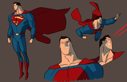

In the above design Superman’s midsection is broken up by  the two red lines and the golden buckle, which form an incomplete belt. This, along with the darker blue of the costume’s sides does wonders in not making it feel like the character is simply wearing a full set of blue tights and a cape.

I suppose we’ll have to wait until next summer to really determine whether or not the new suit works. Until then, these are my thoughts

If you want to keep reading about this particular topic, io9 wrote a great article called “The War on Superman’s Underpants.”

Evan and Gordon Talk: Adventure Time‘s Artistic Merit

DISCLAIMER: This week we kind of dropped the ball, so our discussion on the topic is short and then turns to how WE can write this feature a little better. Our apologies.


GORDON:
 Dear faithful and fanatically devoted readers, before we begin, I’d like to give a shout-out to my buddy Pat Noble, socialist candidate for the Board of Education in Red Bank, NJ, who has just been elected. Nice going, comrade!

And now back to the subject of the night: Is there artistic merit in Adventure Time?

EVAN: Whoa. You’re gonna shameless-plug your friend and then let me discuss the topic? Say something about it, haha.

GORDON: Is there artistic merit in beloved Cartoon Network show Adventure Time? Well, let’s break down what we mean by “artistic merit.” Evan?

EVAN: Is it worthy or deserving of being called art? Alternatively, does the show have the admirable qualities or attribute that art has? I guess a question to answer your question is: What is art?

GORDON: Well, let’s not try defining “art”. We’ve been trying to do that ever since we first started scratching pictures of fat ponies onto cave walls, and I doubt we’re gonna solve it in the next half hour or so. Let’s instead focus on the “merit”- what is it that makes ANY show good?

EVAN: Here’s a factor that relates directly to Adventure Time: Accessibility. How accessible does a show have to be to be good? Does it have to be accessible to be good?

GORDON: Are we talking about mass appeal here?

EVAN: Eh, sure, why not.

GORDON: Well, we gotta address that then. I mean, Twilight and the work of Michael Bay are popular, but they aren’t good. At the same time, you can’t just have a show that only you find funny, and then still call it good, right?

EVAN: You’re right. So is there a magic number of people we have to reach when it comes to a show being good? I shudder to remember Tim and Eric Awesome Show, Great Job! and how much our one friend used to love it.

GORDON: What’s worse is that my dad is into that show for some unfathomable reason. But the point is, a good thing ought to be popular to some degree, but popularity can’t be the sole element.

EVAN: Okay, so how about execution? How well the show pulls off whatever it’s supposed to be doing. Adventure Time is a show about a boy and his magical dog that is also his brother adventuring in a colourful post-apocalyptic fantasy world, but it works. They pull it off. I personally think this has a little something to do with its easy-to-digest ten minute segments.

GORDON: And there’s really no way of arguing with that- the story-telling is spot-on, but there’s gotta be more than that. The same can be said  (and this is gonna give Evan an aneurysm), to some degree, of the copy-paste work of Seth McFarlane.

EVAN: Wait. What. What are you saying. What about Seth McFarlane and his horrible, horrible television.

GORDON: What I’m saying is that McFarlane’s shows are both popular and (for what they are) well-executed, and yet we can both agree that his shows aren’t really “good,” at least, not anymore than a bag of chips is “good” food.

Therefore, there’s got to be another element at play, right?

EVAN: Ugh. I can’t even look at the chat window I’m so offended you would say something like that. I wish he would be “well-executed.” Share your other element if you must.

GORDON: Uniqueness. The show has to be unique. It’s not enough to go through the motions (as McFarlane’s shows do), you have to actually be able to make your show something that can’t be seen anywhere else.

EVAN: Something to make your stuff stand out of the crowd, okay, that’s fair. So I guess we can see how Adventure Time stands up to the criteria we’ve come up with.

  • Accessible? Eh, I’d say so, for its demographic and older.
  • Popular? Yeah, again for who I’ve stated.

You want to let these nice people know if it’s unique?

GORDON: Soooo Unique. If you can find anything remotely similar to it made in the past decade, I will slap Evan on the ears and vote for taxing the homeless.

EVAN: I mean, like I said: Boy. Magical Dog. Colourful fantasy world that is also post-apocalyptic.

EVAN: What more could you want?

GORDON: Vampire rocker girls?

EVAN: I would not mind.

GORDON: Oh wait, we’ve got that too.

You want D&D references spliced in with Science Fiction and elements of Gothic Horror?

EVAN: I think we could go for some.

GORDON: WELL WE’VE GOT IT!

EVAN: I think it’s clear that we think Adventure Time is a good show, but one thing that’s been painfully clear with this entry of E&GT is how much trouble it’s been doing this. Might I suggest a little something?

GORDON: Go for it.

EVAN: Let’s just choose our own topics for a little while, just to really get back into the swing of things. Keep things casual, going back and forth, avoid the heavy questions. And then we can ease our way back into all this.

GORDON: I am inclined to agree with you on this one.

EVAN: Yeah? Awesome. Anything in particular you wanted to casually discourse about next time?

GORDON: Well, I don’t think my suggestion about the Disney takeover of the Star Wars franchise was all that bad, even if Adventure Time did win by a landslide…

EVAN: I kinda wanted to talk about Deadliest Warrior.

GORDON: That would be likewise awesome. Let’s do that.

EVAN: Yes. Awesome. I’m going to post this because we are men true to our word and we promise an E&GT every Wednesday. We shall discuss Deadliest Warrior in a week. Or this weekend, maybe, just to get ahead. I mean, whatever.

GORDON: Good night, everyone.

EVAN: Yep, sorry this wasn’t as awesome or decent as usual. But we will be back! With a vengeance. And remember:

Shame Day: Greg Land

As you probably know by now, comics are very important to me. It’s good art and good writing coming together as one, the creation of a medium that’s unique among all others. The ideal combination is a skilled creative writer coupled with a hard-working, attentive artist. This pairing doesn’t always happen, though. Sometimes a writer is forced to work with Greg Land.

If you type “Greg Land” into Google the second search result that comes up is the site known only as “LAAND!“, though the name of the url more than makes up for the possible vagueness. The site is a tumblr dedicated to the man’s “generally bad artwork and the sexist ethical repercussions to hiring him nowadays.”

To put it plainly, Greg Land doesn’t draw, he traces. This isn’t all the time, but the fact of the matter is that he does it so blatantly and conspicuously that it is impossible to ignore. The following gif will do more to convince you of this than a thousand pages of my writing.

There is seriously no ignoring that. Clicking the image links to the blog JIMSMASH!!! which catalogues many, many more instances of his copycatting. Another fantastic gif’d example is one where, and this is practically mindblowing, Land rips off of himself. The image on the right transitions back and forth between Jean Grey and Black Canary, both drawn by Land [and for competing companies, too].

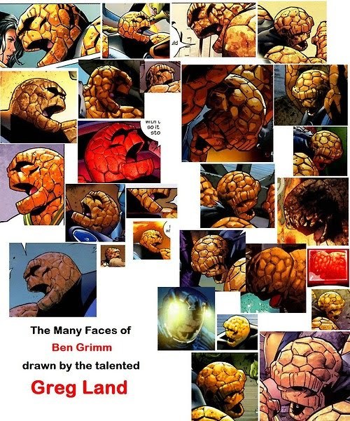
Here’s a pretty great image. It’s “The Many Faces of Ben Grimm drawn by the talented Greg Land.” He is a man who knows how to recycle.

Now all that I’ve mentioned is pretty atrocious, but here’s where it gets unbelievably worse. Observant comic fans have noticed that a lot of his references appear to be directly taken from porn films. There isn’t an argument more convincing than this picture:

What’s most upsetting [and there is a lot to get upset about] is that Greg Land continues to get work.

Marvel NOW! is the company’s decision to take their best titles and switch around talented writers and artists, creating combinations that will take their characters in new and exciting directions. Somehow Greg Land was assigned to Iron Man with writer Kieron Gillen who had this to say about him: “That’s the thing with Greg Land: his photorealistic style really pops and it’s a glamorous book in that way.”

That’s the thing, Kieron. They look photorealistic because he has traced actual photographs.

And right away, with our first look at the book’s interiors, we can already see that Land has ripped off of photos of a cosplayer, and from actually talented artist Adi Granov.

The saddest part is, Greg Land doesn’t even really know how to draw people anymore. His knowledge of anatomy is paltry at best, as helpfully illustrated in the post “Hips Don’t Lie: Pelvis? What Pelvis?” He may have been a legitimate artist once, but he’s traced so much and so often that when he does draw something freehand he can barely recall how to.

I understand that deadlines need to be made, and that in the world of comics this is not always easy to do. That should be taken into account, but this has gone on for so long it hardly stands as a defence. Greg Land should feel bad. His work is absolutely nothing to be proud of.

Fame Day: Racebending.com

This Thursday I want to call attention to a website that’s been in this blog’s links-sidebar basically since its inception. I came across Racebending.com around the time it began, and their stance on equality casting and representation in the media is one of the many reasons I decided it was time to start writing more about what I thought mattered.

As their name might suggest, the site came about as a response to M. Night Shyamalan’s film adaptation of the Nickelodeon show Avatar: The Last Airbender. The entirety of the series was set in a distinctly Asian-inspired universe, and the casting decision was made to have the majority of the protagonists be played by Caucasian actors. The change is starkly apparent in the image below:

And for those of you who don’t think Zuko is a villain, click on the link for a thorough explanation.

The organization did a great amount in revealing the decisions that went into the making of the film. Most importantly was their breakdown of the casting calls that read “Caucasian or any other ethnicity,” and how the language affects those who apply for the roles as well as hinting at what they are looking for. They also exposed the blatant racism used by casting director Deedee Rickets, who was quoted as answering the question “Are you at a disadvantage if you didn’t wear a costume?” with the following:

Absolutely not! It doesn’t mean you’re at a disadvantage if you didn’t come in a big African thing. But guys, even if you came with a scarf today, put it over your head so you’ll look like a Ukrainian villager or whatever.

Although the movement was not enough to sway the studio, producers, or director of the film, the site stays up, continuing to work towards educating the internet on when and where whitewashing is taking place, and what people can do to stop it. They also take care to call attention to those who are advancing the role of minorities in the media, giving credit where it’s due.

Most recently the blog has been concentrating on the upcoming film Cloud Atlas, which stands out due to its use of “yellowface” by various actors. While the directing Wachowski siblings and others have cited the theme of reincarnation and  the fact that actors of colour will also be playing White roles, media liaison Mike Le lays out the stark difference between the two. In an interview with  the radio station Vocalo 89.5 he explains the tradition of yellowface in cinema as a means of controlling the perceptions of a race, and the damage it has done and can still do.

All in all, Racebending.com is run by people who are doing good things, and who care about representation whether it be based on race, gender, or orientation. They strive to see the media reflect the immense amount of diversity in our world, and that alone should be worth checking them out.

Fame Day: Kris Anka

Today’s Fame Day post is dedicated to the artistic genius of Kris Anka. I’ve been following his work on the superhero redesign blog Project : Rooftop for some time, and was thrilled to see him get the recognition he deserves on ComicsAlliance yesterday.

Apparently Anka had been hired by Marvel to design the costumes for the new Uncanny X-Force series, and he puts his own spin on the new roster of Storm, Psylocke, Spiral, Puck, Lady Fantomex, and their nemesis Bishop.

The biggest changes are in Psylocke losing the unitard for more of a full body suit, and Storm reverting to her 90s look with a fantastic-looking mohawk. Utility was definitely prioritized, and story as well. Working with Uncanny X-Force writer Sam Humphries it was decided that the grey in Spiral’s outfit should be opaque. This fit with the knowledge that Spiral was a character was “a little more confident in her sexuality,” without making the costume’s raciness over-the-top .

Anka’s design philosophy for the team is as follows:

The costume themes were something from the very beginning that I wanted to strive for. I felt that every costume should not only highlight the personality of the character it is wrapped around, but also of the function that the costumes will serve towards. At the end of the day, these costumes have to look like they can get into a tussle, and actually be able to handle it.

This certainly translates over to the many other redesigns that can be found on his various art blogs, and one I want to highlight is his version of the  Avengers.

From left to right: Iron First and Crystal, Ares and Ms. Marvel, Iron Man and Venus, Bucky (Winter Soldier) and Thor.

In another illustration, entitled “avengers – dont f-ck with us,” the entire team is explained in the description, with the idea that he wanted his Avengers to be “a family first off.” Ms. Marvel acts as leader, Venus as a strategic asset, Ares carries Stark-designed weapons that can collapse in on themselves. Every design point has a reason, and it all adds up to clean, recognizable  costumes.

His redesigns for DC’s trinity [Superman, Batman, and Wonder Woman] are images I go back to over and over. His vision of the the Last Son of Krypton shows that you can do away with the red shorts over blue tights, provided you break it up with a little bit of colour [the yellow buckle, the red lines on the side]. I’m looking at you, costume designer for Snyder’s Man of Steel.


All in all, Kris Anka is a name to look out for. In the ComicsAlliance interview Humphries admits that “My only wish is that we could keep going until we redesigned the entire Marvel Universe!” If only that were true.

You can find Kris Anka on various places on the internet:

deviantART: http://anklesnsocks.deviantart.com
Blogger: http://anklesnsocks.blogspot.ca/
tumblr: http://kristaferanka.tumblr.com/
twitter: https://twitter.com/kristaferanka

And don’t forget to search for his stuff on Project : Rooftop!

Go Listen to “Guilty Pleasures: Art and Politics”

Two days ago Gordon and I talked about “hipster racism,” a topic he heard about via an eye-opening lecture by novelist China Miéville. The talk was titled Guilty Pleasures: Art and Politics, and discussed far more than what we were able to given our time.

A number of things: Firstly, I am not going to discuss or summarize his lecture in its entirety; it was forty-some minutes long and that would be ridiculous, just listen to it for yourself. Secondly, I am not a socialist, and much of what he was saying was through that filter. He did, after all, speak at a little something called “Socialism 2012.” I am not someone who has very strong political leanings, but I am someone who truly loves art in its many forms. The following are the three ideas he spoke about that stuck me the most.

The Artist and Their Art

Miéville, about a minute in, states that the socialist position on art and politics is this: “[socialists] do not judge art by the politics of the creator of that art.” He then quickly adds that they do so all the time anyway. I briefly wrote about this in a post about Jewish children’s author Rich Michelson. Michelson hosted a session that was largely about race and background, and how they impact audiences’ opinions of a work. Is a Jewish author allowed to write about the struggle of the civil right’s movement? And if not, then why?

The relationship between creator and his or her art is heavily debated, but its extremes are very easy to criticize. Miéville said that they’d all sat through “egregious folk music” simply because of the grounds of its sentiments expressed. Simply having a good message does not make art good. A Christian movie about the horrors of porn is not in and of itself a bad thing; having it feature ghosts [and be a clear knock-off of Paranormal Activity] is. To put it in the form of a proverb, “the road to hell is paved with good intentions.” Feel free to replace “hell” with “bad art” or “disappointed audiences.”

Guilty Pleasures

The title of his talk and what I’m the most interested in, Miéville listed different axes of socialist guilt. The third of which [17:56] he says is:

The question of quality: “I know it’s not very good but I like it anyway.” A declaration of kind of defensive guilt.

The thing is, he realizes that the statement is inherently flawed. By saying something is not very good we declare that we can make qualitative judgements about art, and this leads to questions like: “What is art? What makes it good, bad, better? What kind of social phenomenon is it?”

When it comes to television shows I have a standard rule, and that is to watch it ’till its dying days. I have watched all of The Office to date, and that is the same as 30 RockHow I Met Your Mother, and a slew of other shows. Sooner or later they begin to break down [see my first example], but I stick to them. The reason I’m bringing this up is The Big Bang Theory.

Gordon hates TBBT. He hates it because, honestly, it’s not a very good show. He often says that “nerdface” is an excellent way to describe their treatment of the characters. That being said, I have, and do [sometimes still] enjoy it. Do I feel guilty? As an English and Writing major, yes. I studied for four years to differentiate between good and bad writing. As a general media consumer and television enthusiast, yes, I still feel guilty. And, as Miéville said, I somehow defend myself by admitting to others that I realize it is not very good.

Does this justify me? I don’t think so. But beyond what it means to be good or bad, what does it mean to like?

What Does It Mean to “Like” Art?

I like the Dungeons and Dragons Monster Manual. I like the novels of Barbara Cummings [sp?]. I like Gramsci’s prison notebooks. [20:15]

None of these statements tells him anything about his relationship with each piece of art, because they’re all so distinct. What further complicates the verb is the discussion of “the art piece one enjoys disliking” [20:32]. We can like to dislike things; Justin Bieber basically encapsulates this idea by himself. While he never ends up truly defining the word, he seeks closure in the writing of another.

What follows is a piece of writing by Lady Mary Wortley Montagu, an 18th century writer, and Miéville’s response to it [34:45]:

“The pretty fellows you speak of I own entertain me sometimes, but is it impossible to be diverted with what one despises? I can laugh at a puppet show and at the same time know there is nothing in it  worthy of my attention or regard.”

This is one of the most liberating things I have ever read in terms of the cultural sphere. It is not obligatory to have footnoted opinions about everything you consume.

I read his meaning in that last paragraph as being that we need not get caught up in guilt. There should be a way of looking at what we like that doesn’t involve us castigating ourselves. I can enjoy the King Fantastic Remix of Drive It Like You Stole It without being a proponent of foul language. Likewise I can read AmazingSuperPowers, be amused, and not have to argue how high- or lowbrow its humour is. While the intent of an artist and the perceived quality of their work should be taken into account, there are times when we can simply like, or more simply enjoy, art, whatever it may be.